sasharesume.com - Portfolio Website
This resume website was a hub for my projects and a place to test the web tools I was learning at the time.
Design Objectives
A project site that reads clearly, while still showing the technical machinery for people who want to inspect it.
Straightforward
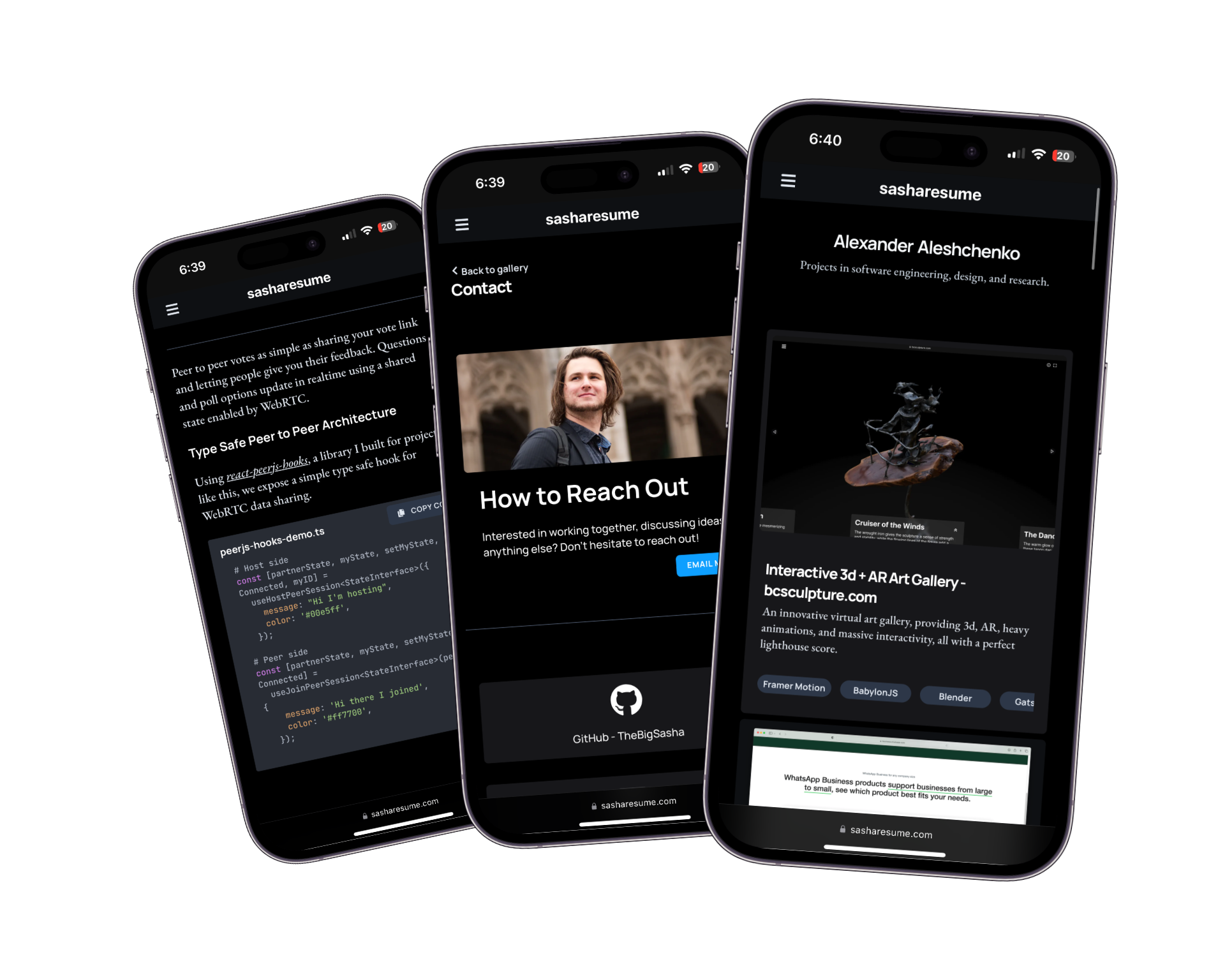
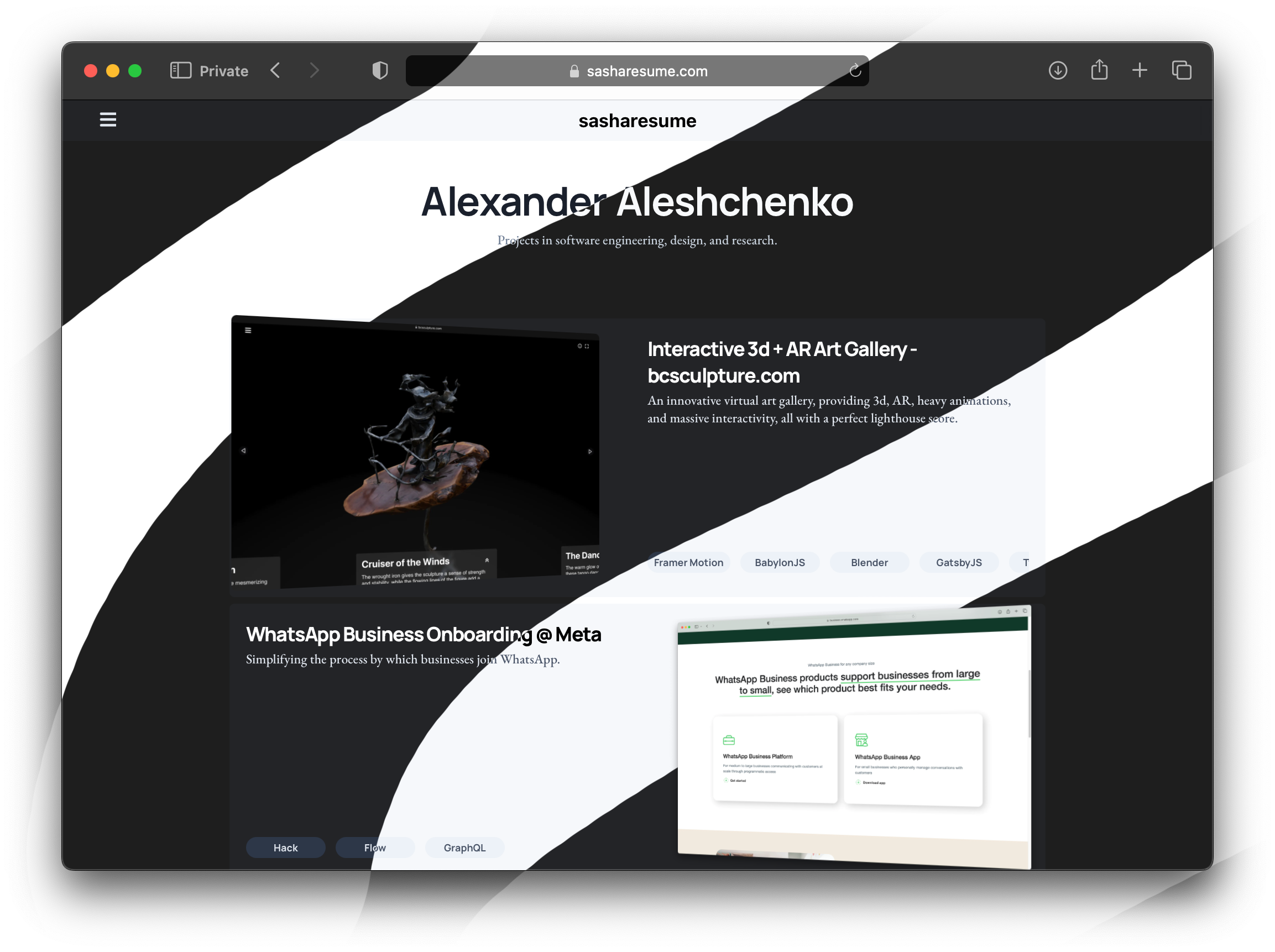
This website is designed around projects, which sit front and center on the homepage. The page should make the work easy to scan before asking anyone to care about the stack.
Responsive
Responsiveness can refer to a website’s ability to render nicely on a variety of devices, and to the speed at which it responds to interaction. Here, I refer to both meanings.
Eye Catching
Animation is used only where it helps explain structure or make the page feel handled. If it gets in the way of reading, it loses.
Technical Overview
sasharesume is built primarily using my favourites among the latest web technologies.
Framework
The fundamental technology underlying sasharesume is
React.JS. React was chosen due to its popularity, and thus the active community and vast selection of libraries, namely for animation and rendering.
Rendering
is responsible for the fast static rendering of sasharesume.
Styling
This is the last of my websites to use styled components. I intend to move the styling of this site to scss modules. However, until that is done, it will continue using styled-components.
and
SASSprovide styling for sasharesume. Compared with alternatives like tailwindcss, this combination of technologies minimizes code duplication and ensures consistency and responsiveness.
On sasharesume, styles are defined in two parts. First, variables are defined and derived in SASS and then components are built out in styled-components.
Variable Derivations - SASS
In my approach to CSS, many project-wide variables are defined in SASS as variables, with overrides for things like color theme preference and viewport size.
/* Color derivations */
$accent: #0e9fff;
$complement: complement($accent);
$complement_bg: lightest($complement);

:root {
  --accent: #{$accent};
  --complement: #{$complement};
  --complement-bg: #{$complement_bg};
}
Note here the use of functions like complement and lightest. These are
which abstract away some colour science and simplify the design process. Inspired by
sitepoint
, the palette system on sasharesume
reduces the complex work of choosing complementary sets of colors for the site to a simple declaration of 1 primary colour.
Additionally, SASS variables are used to simulate some useful tailwindcss style classes for easy use in styled components.
$border-radii: (
  none: 0,
  sm: 0.125rem,
  default: 0.25rem,
  md: 0.375rem,
  lg: 0.5rem,
  xl: 0.75rem,
  '2xl': 1rem,
  '3xl': 1.5rem,
  full: 9999px,
);

@each $size, $value in $border-radii {
  .rounded-#{$size} {
    border-radius: $value;
  }
  :root {
    --rounded-#{$size}: #{$value};
  }
}
These style variables allow for highly modular styling, with consistent values for components throughout the site.
Re-Usable Blocks - Styled Components
Using styled-components leads to the most readable and re-usable styling code.
export const SSecondaryButton = styled(SProjectLinkButton)`
  background: var(--gray-200);
  color: var(--gray-700);
  &:hover {
    background: var(--gray-300);
`
In this example, we benefit from all of the pros of our past approach:
Declarative styles allow code re-use, see the inheritance from
SProjectLinkButtonSCSS variables allow for instant, and idiot proof dark theme support, and theme-consistent colours.
Component format styles allow for easily readable JSX in content rendering components, and separation of concerns (styling vs content)
The ideal styling solution
By combining the power of SASS Variables and derivations and styled-components, we achieve great code re-use, modularity, separation of concerns, not to mention small bundle size.
Content Management
was the choice for content management for sasharesume due to it’s developer-first architecture and its flexible plugin model. To help use Sanity’s at times cumbersome schema, query, and type definition syntax, I developed a custom
meta language and graphical tool for defining Sanity Schemas
.
Animation
CSS animations are the best tool for web animation, and pure CSS is the ideal way to handle animations on any website if possible to minimize bundle size and maximize performance.
Due to the complexity of some of the animations on sasharesume
,some bigger tools were brought in. Namely,
Framer Motion.
s most prominent use on sasharesume is in the swipe page transitions.
Using AnimatePresence and popLayout, sasharesume has uniquely
fluid and elegant page transitions, which do not require the
view transitions API
which is currently
not well supported
(as of 2023).
      <TransitionContainer id={"outer-transition-container"}>
        <AnimatePresence mode={'popLayout'}>
          <TransitionInterior
            transition={transition}
            key={pathname}
            initial={initial}
            animate={animate}
            exit={exit}
            onAnimationStart={() => {
              const hashArg = window.location.hash
              if (pathname !== '/' && !hashArg ) {
                  const outer = document.getElementById('outer-transition-container')
                  if (outer) {
                    outer.scrollTop = 0
                  }
              }
            }}
            id="page-transition-container"
          >
            {component}
            <Footer footer={settings?.footer} />
          </TransitionInterior>
        </AnimatePresence>
      </TransitionContainer>
Custom Libraries
, my in house library for reactive animated components is prominently used on sasharesume for several key effects. Namely, the text cascade animation on the homepage, navigation menus are tbsui components.